Tag Archives: Autocord
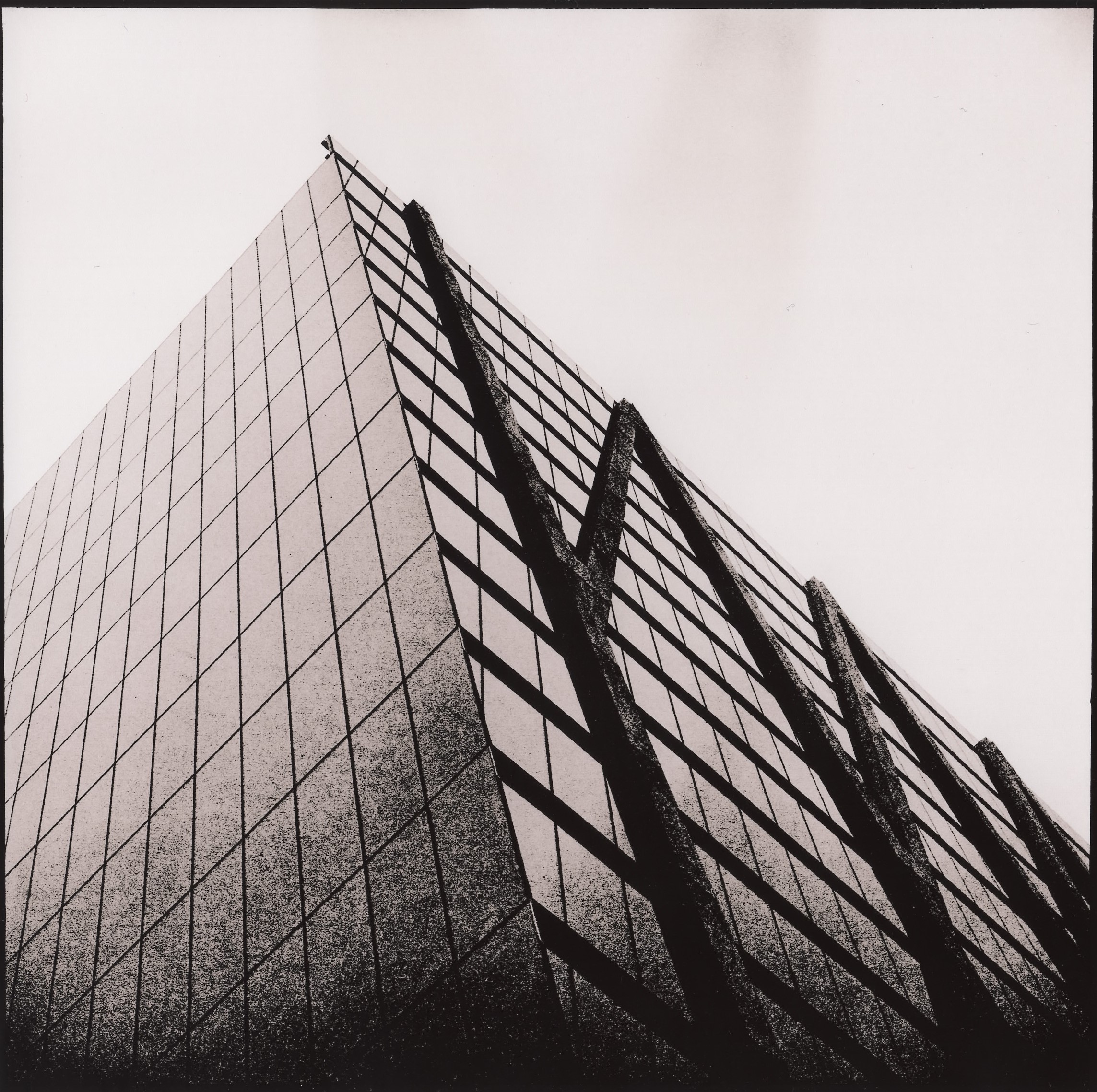
Buildings
Rocketpunk Alternate Prints
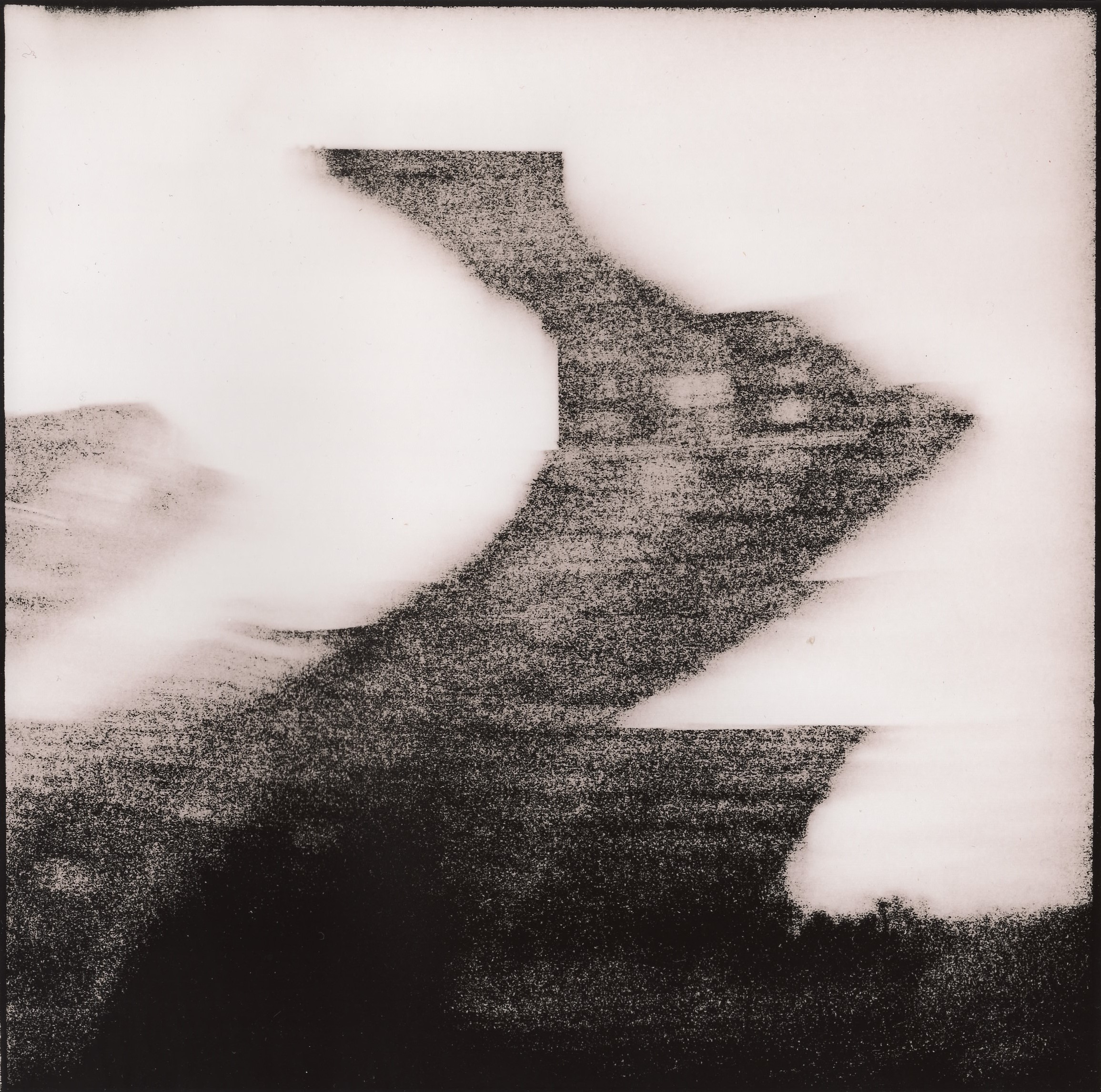
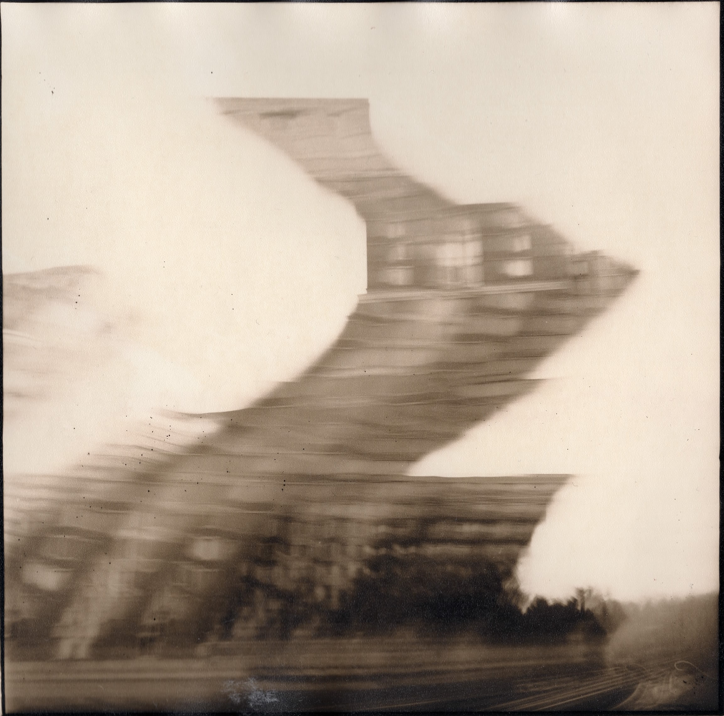
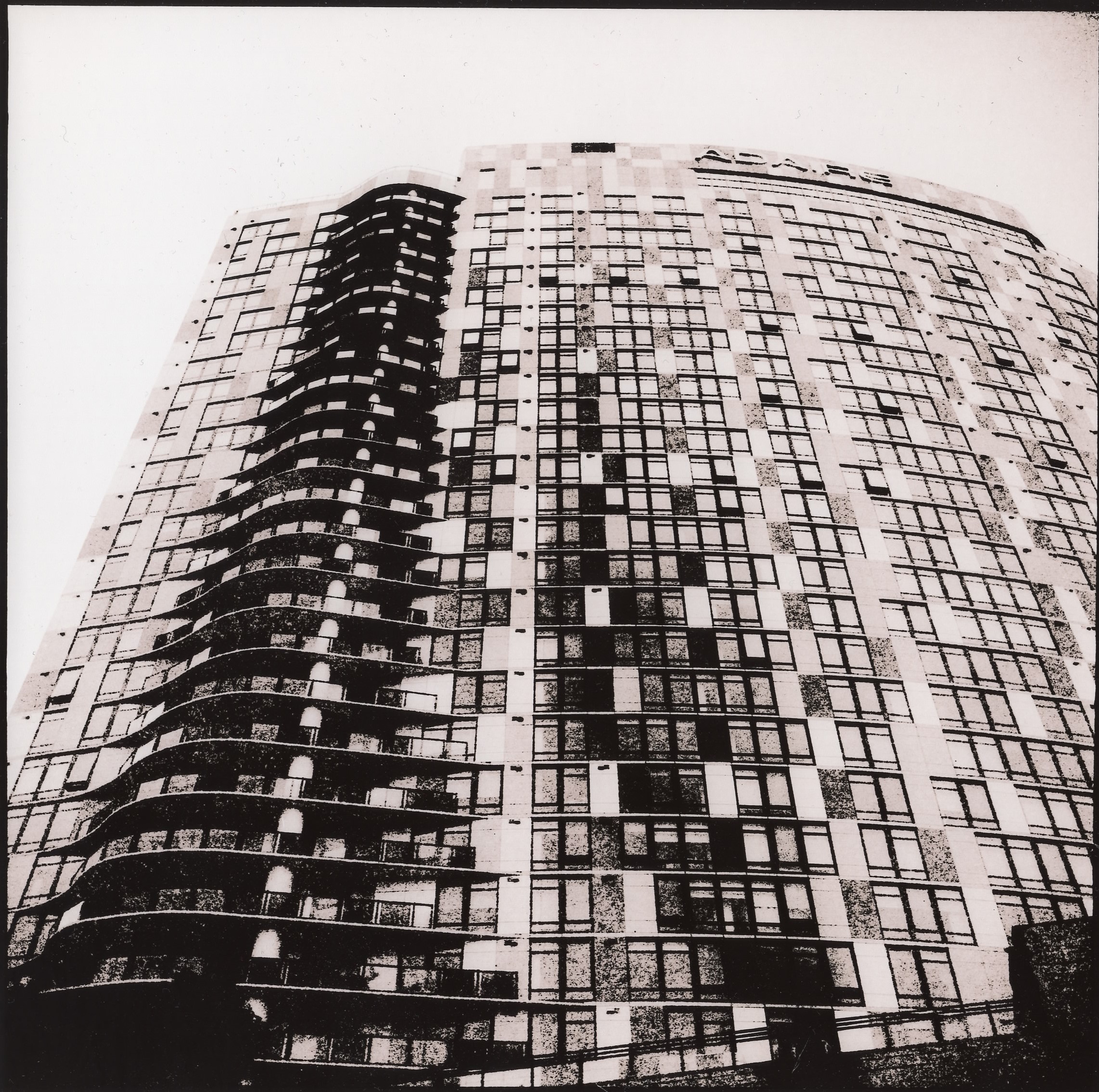
Two of these images from the Greenbank Radio Astronomy site have been printed before on a different paper and appear in earlier postings. It’s interesting to compare how the lith developer chemistry interacts with the emulsions of different papers to create radically different effects on the same image. (Click on the “rocketpunk” tag at the bottom of the post to compare this with older versions)
The images in this post were made with Moersch Easy Lith developer on Arista EDU RC paper. In the earlier images they were made using the same developer but printed on Fomatone MG Classic paper. The former usually results in a very high contrast, super grainy and gritty image with a slight yellow-pinkish hue to the highlights, while the latter gives me a smoother, dreamier image with more of a brownish-pinkish color, with out-of-focus areas progressing to heavier grain.
As a result I tend to choose different papers for different types of images depending on what type of atmosphere I want to portray.
As manufacturers tend to start or stop producing certain papers without notice it can be tough to find good papers for lith printing sometimes. Some years ago my favorite lith paper was made by Kentona, but they stopped making it suddenly and so I had to search for new options. Many common papers such as Ilford Multigrade or the old Kodak paper (if you find any) simply do not work with lith developer at all and are only suitable for standard black and white printing, so searching the net for advice while experimenting with various brands and models is necessary.
And the same goes for lith chemicals…


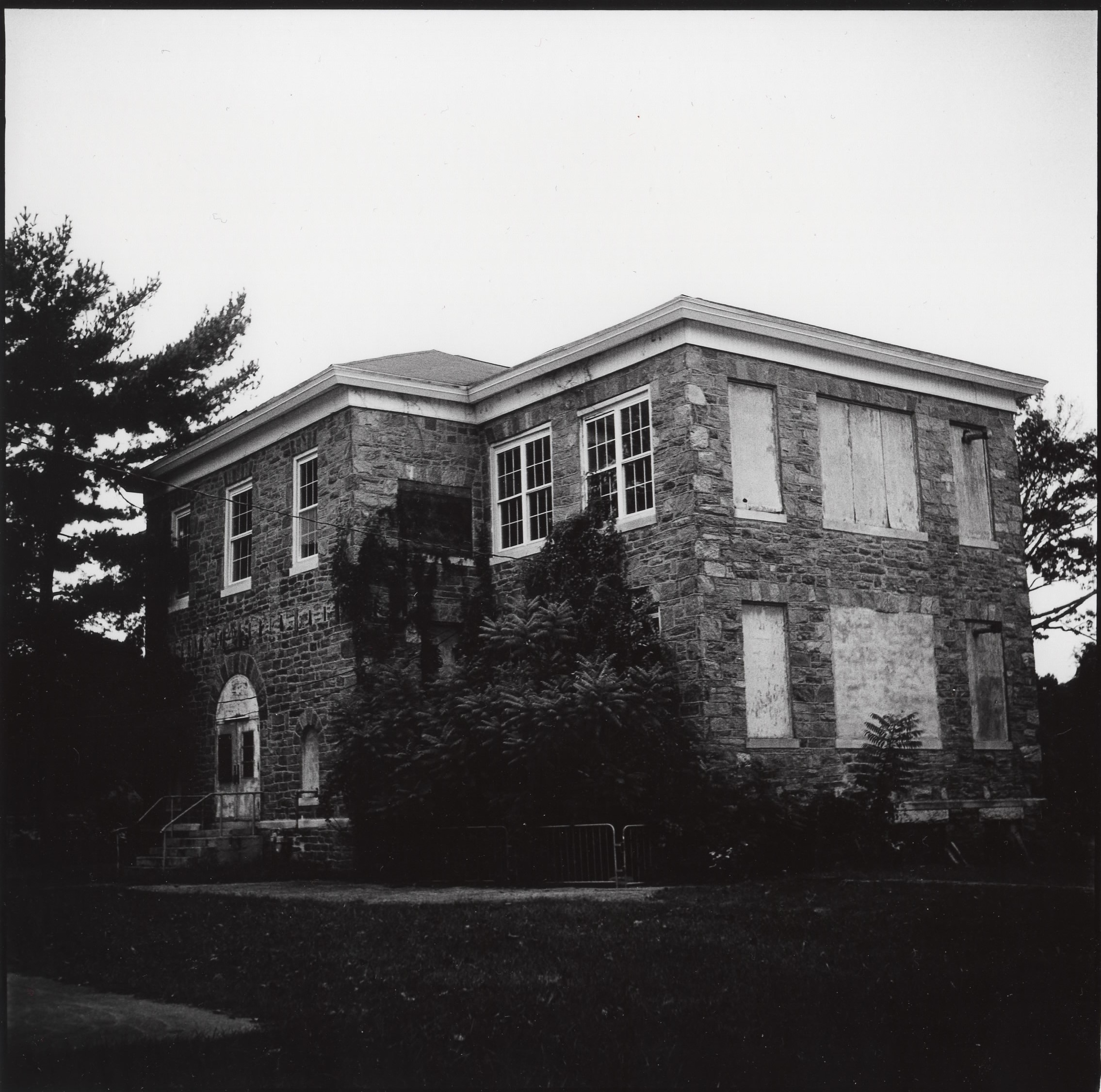
Reston
Altered Perception
Altered Perception
Both of these photos were featured in recent posts, but this time I decided to make “lith prints” using a special two-part chemical developer. It’s more expensive and time-consuming, and it doesn’t fit well for every black and white image, but I can usually pick out ones that will work.
Reston


Reston
Energy, Memory, and Motion
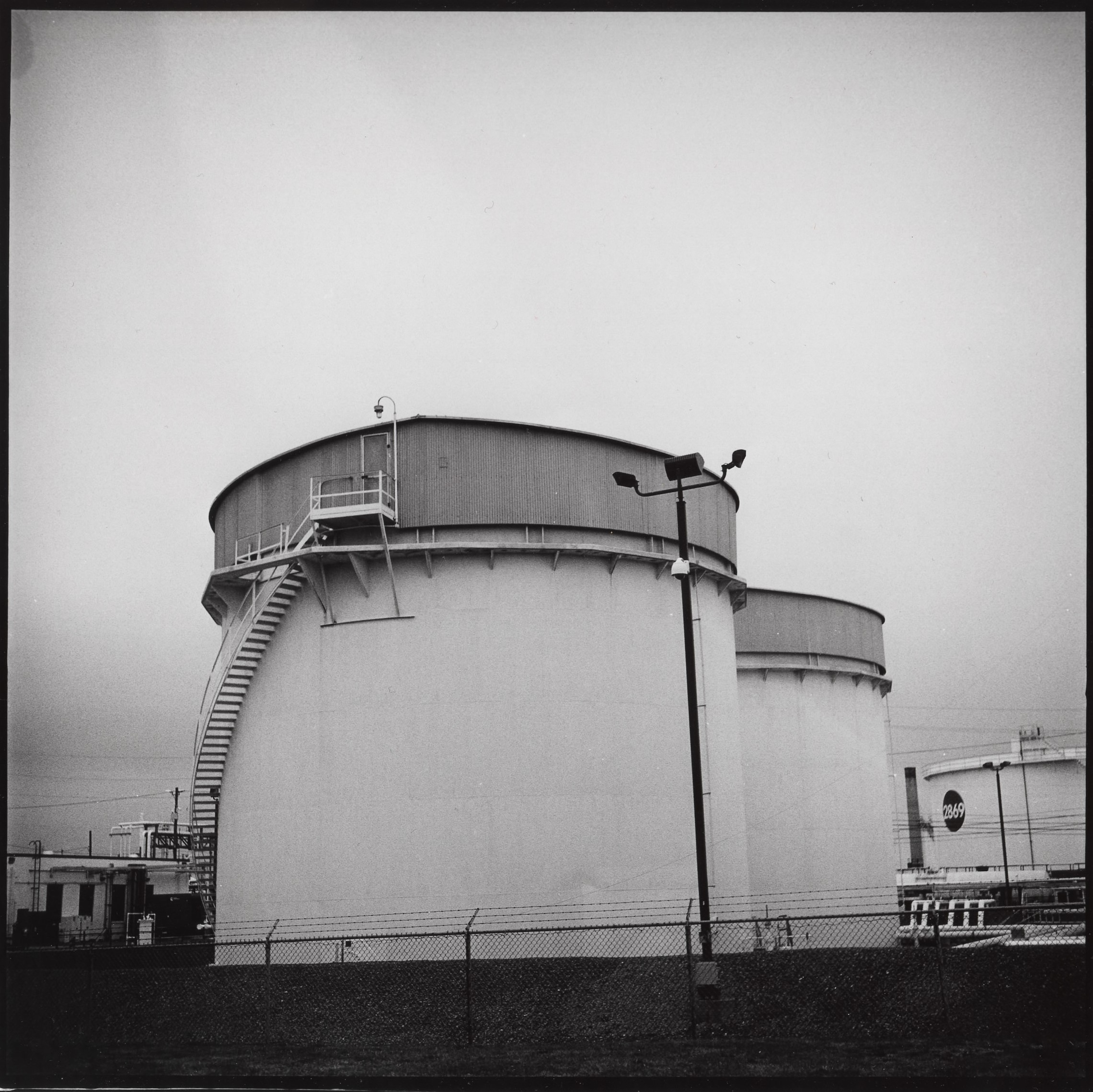

Energy
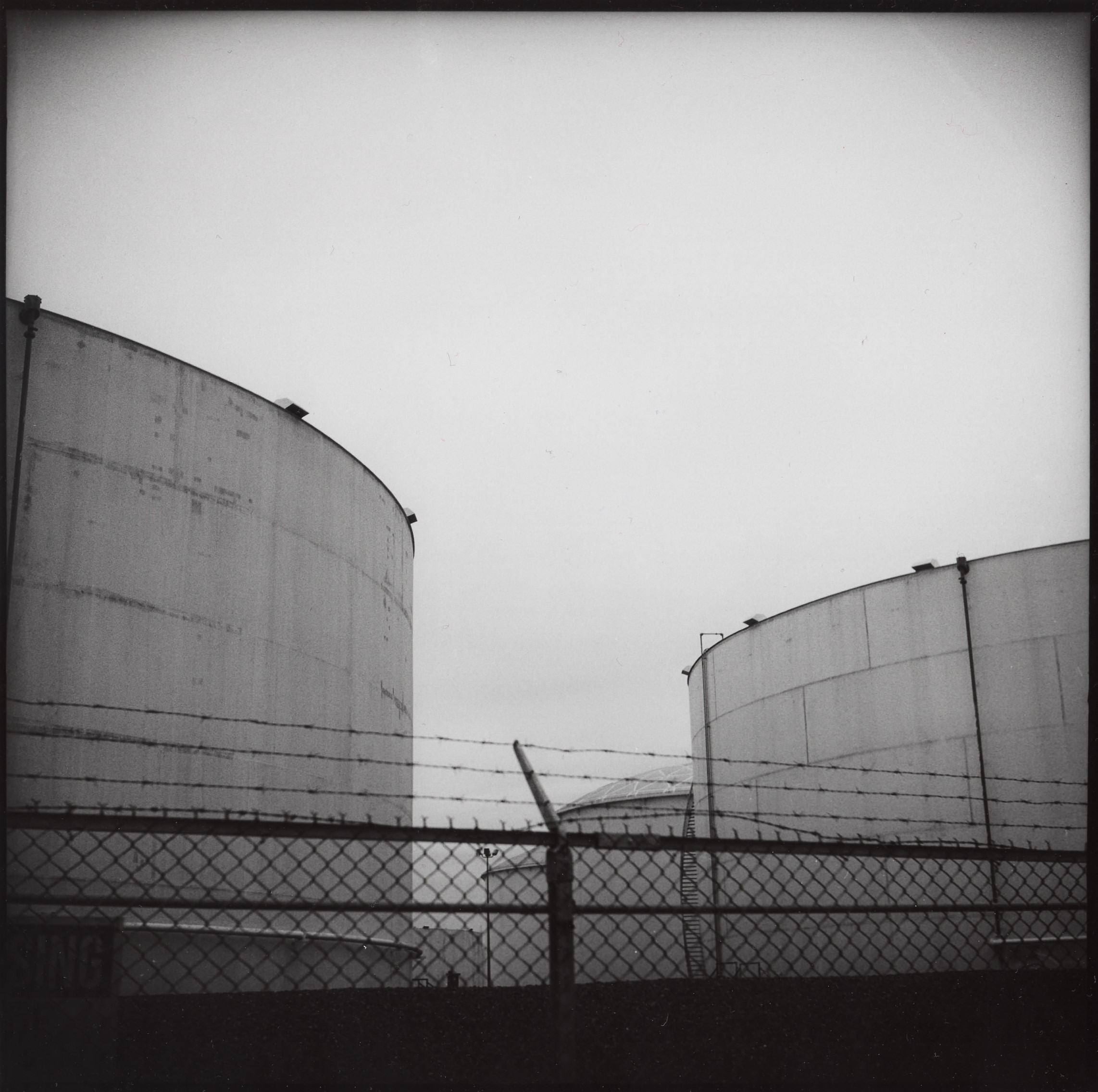
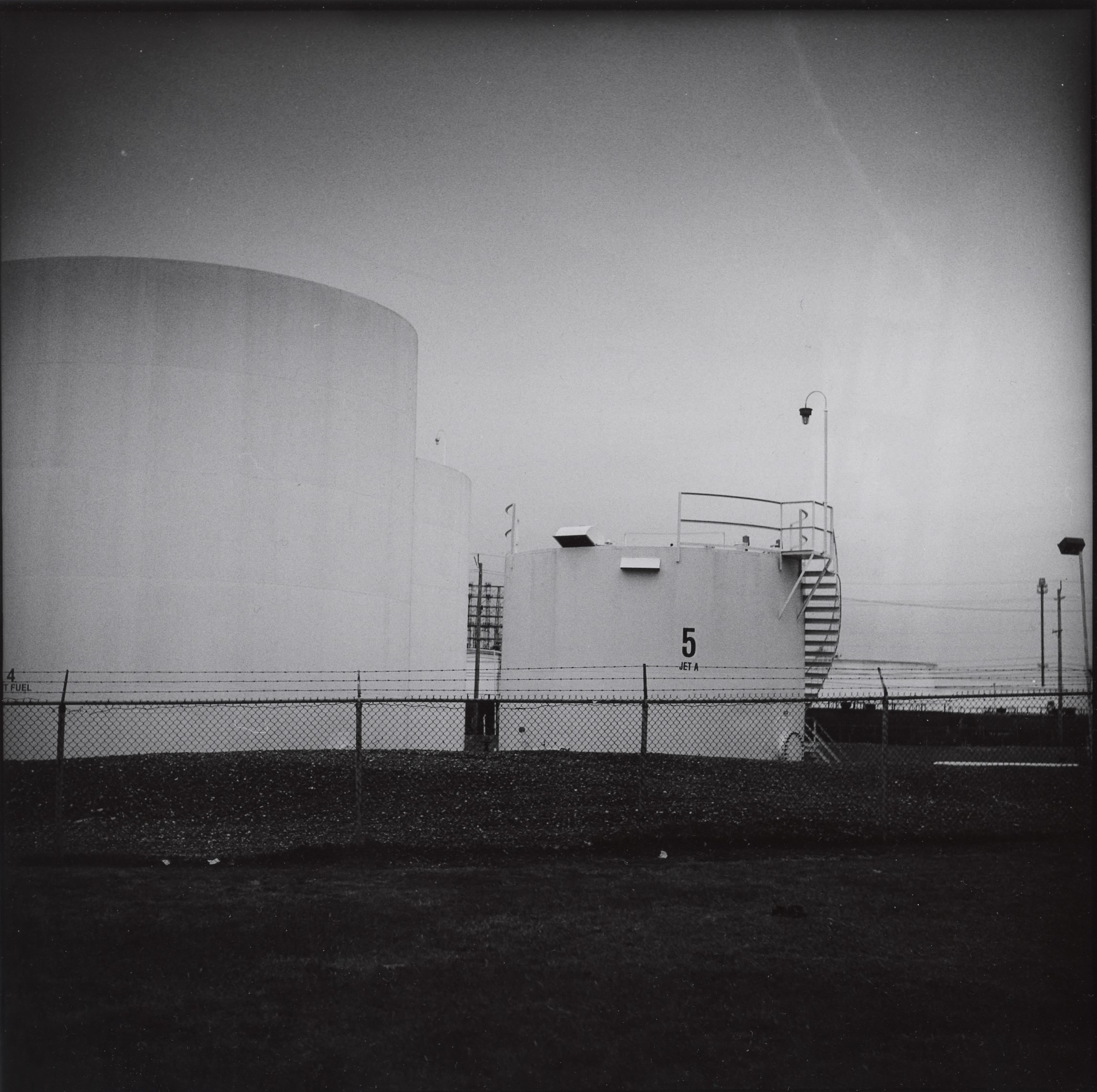
Jet-A
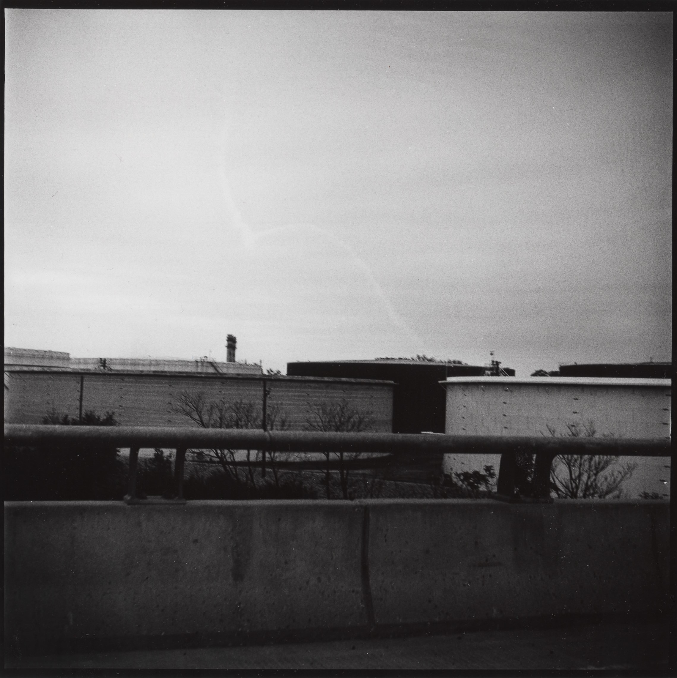
Suburbia
Image
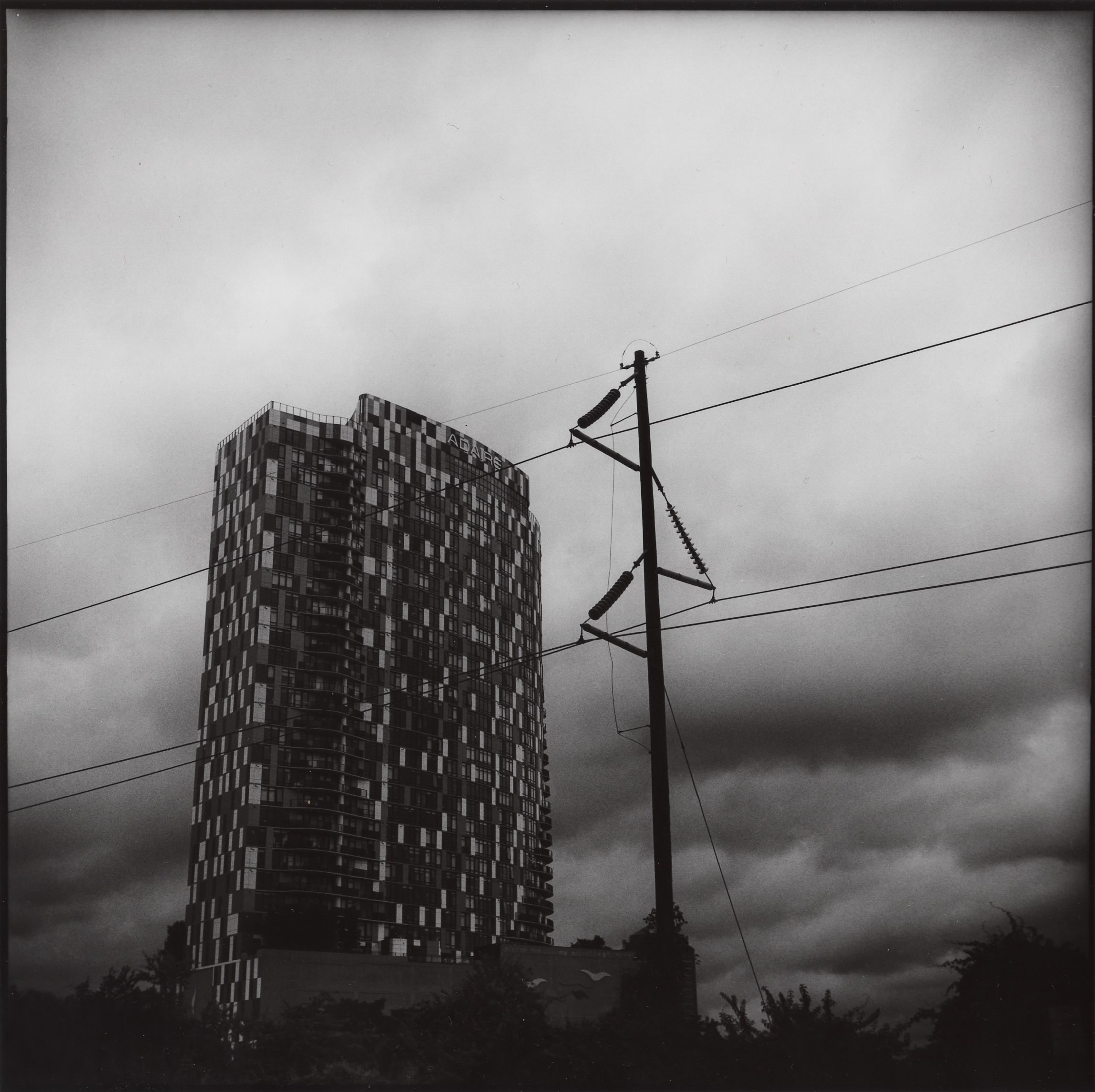
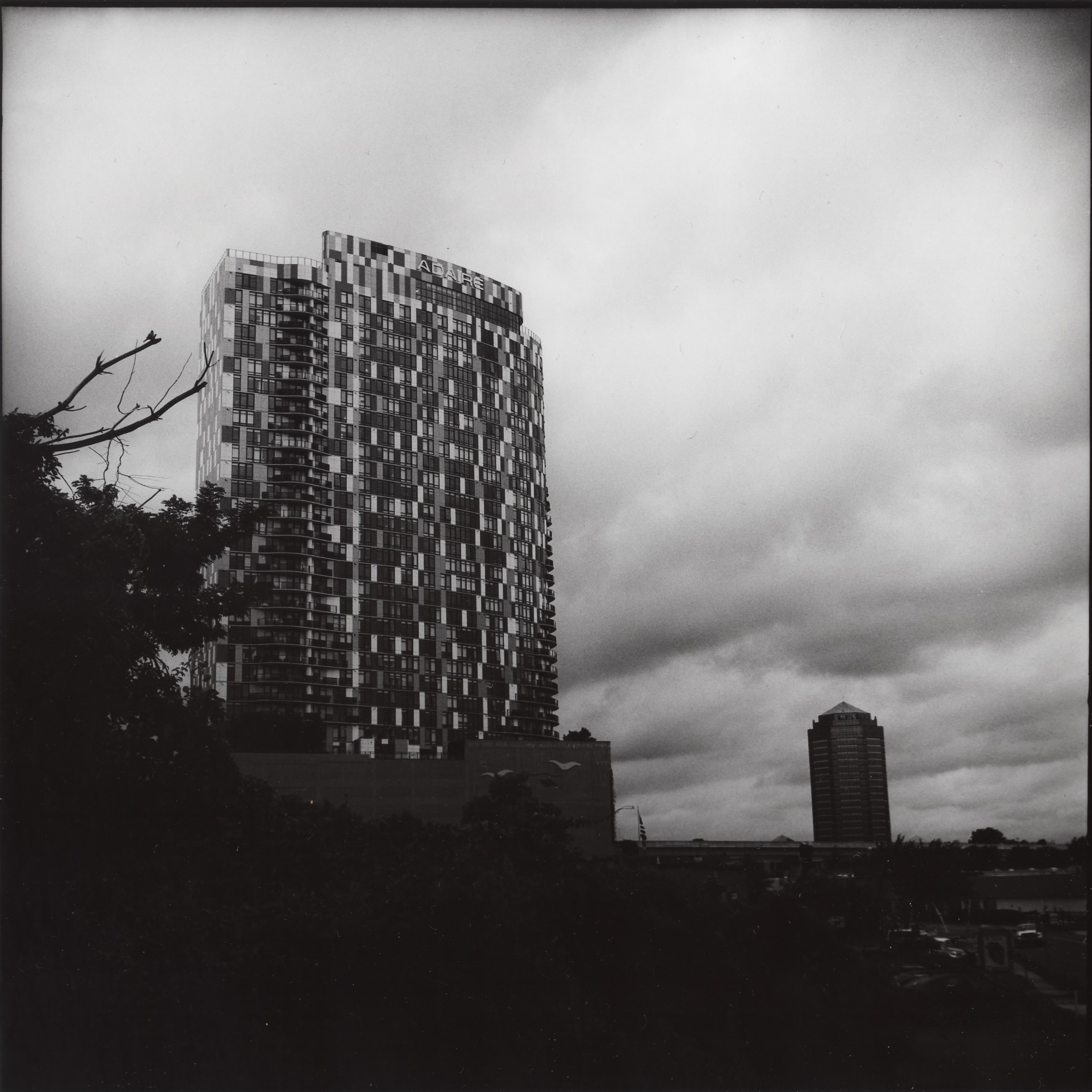
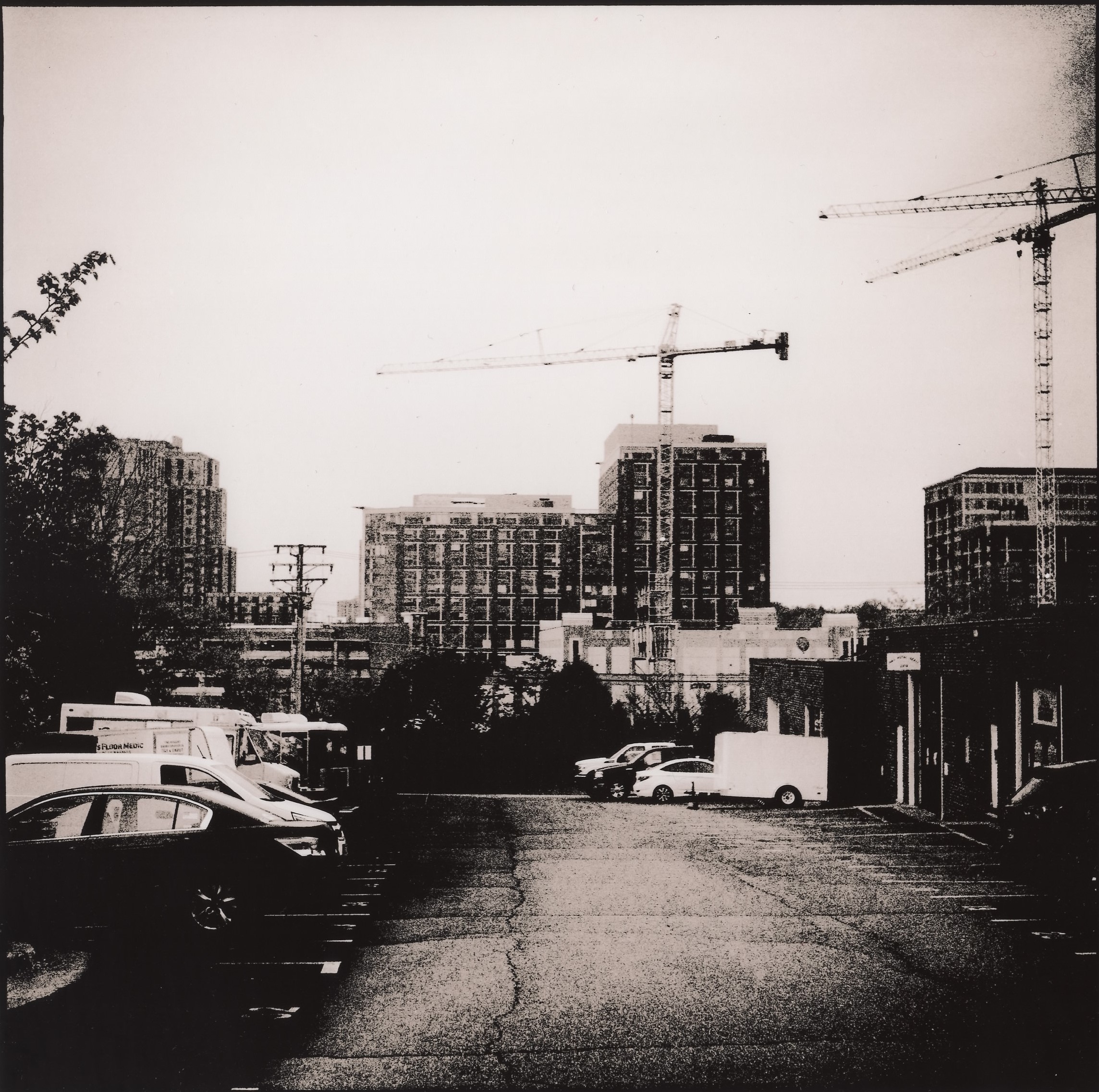
Suburban Gloom Workshop
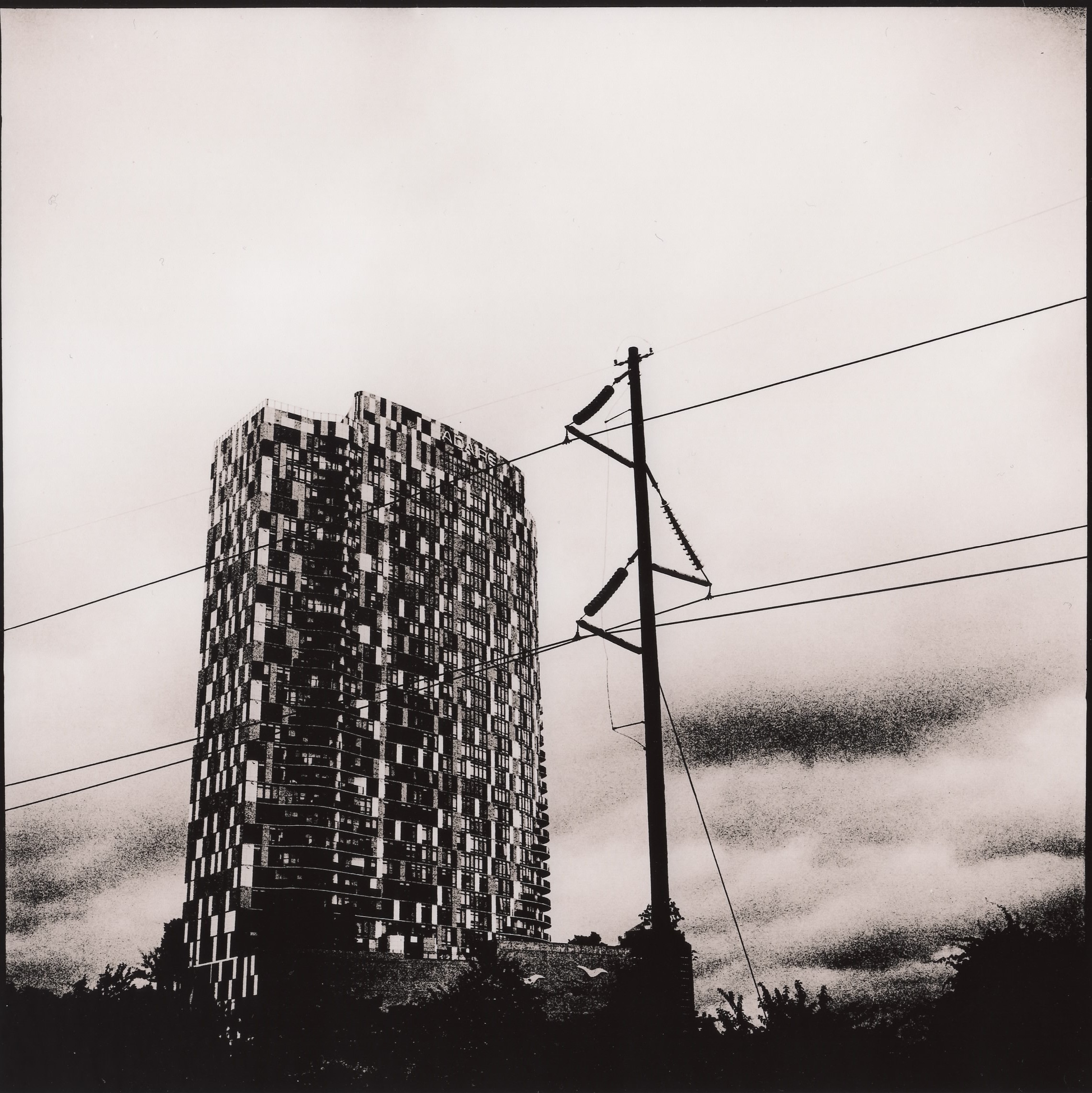
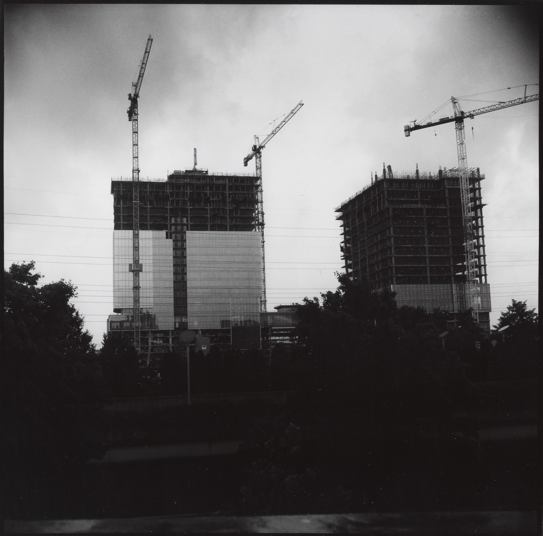
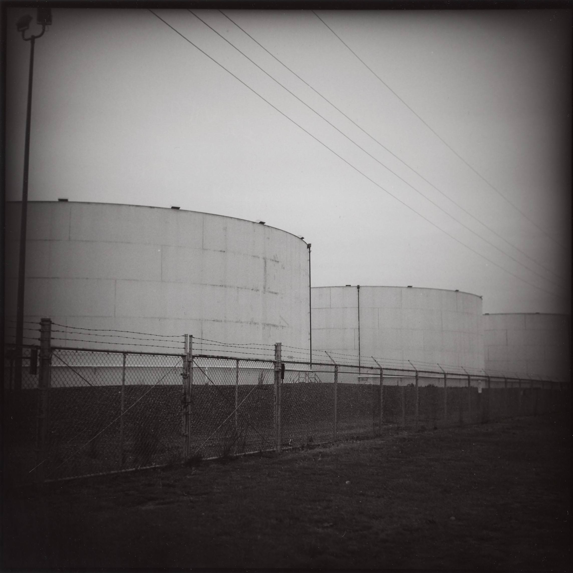
Normally I just post interesting photos with no explanation and let them speak for themselves, but I thought this might be interesting to those who wonder about the process.
With chemical print photography, you can go through a lot of paper to get a final image you want to keep. In this case, I made five prints before I got something close to what I wanted.
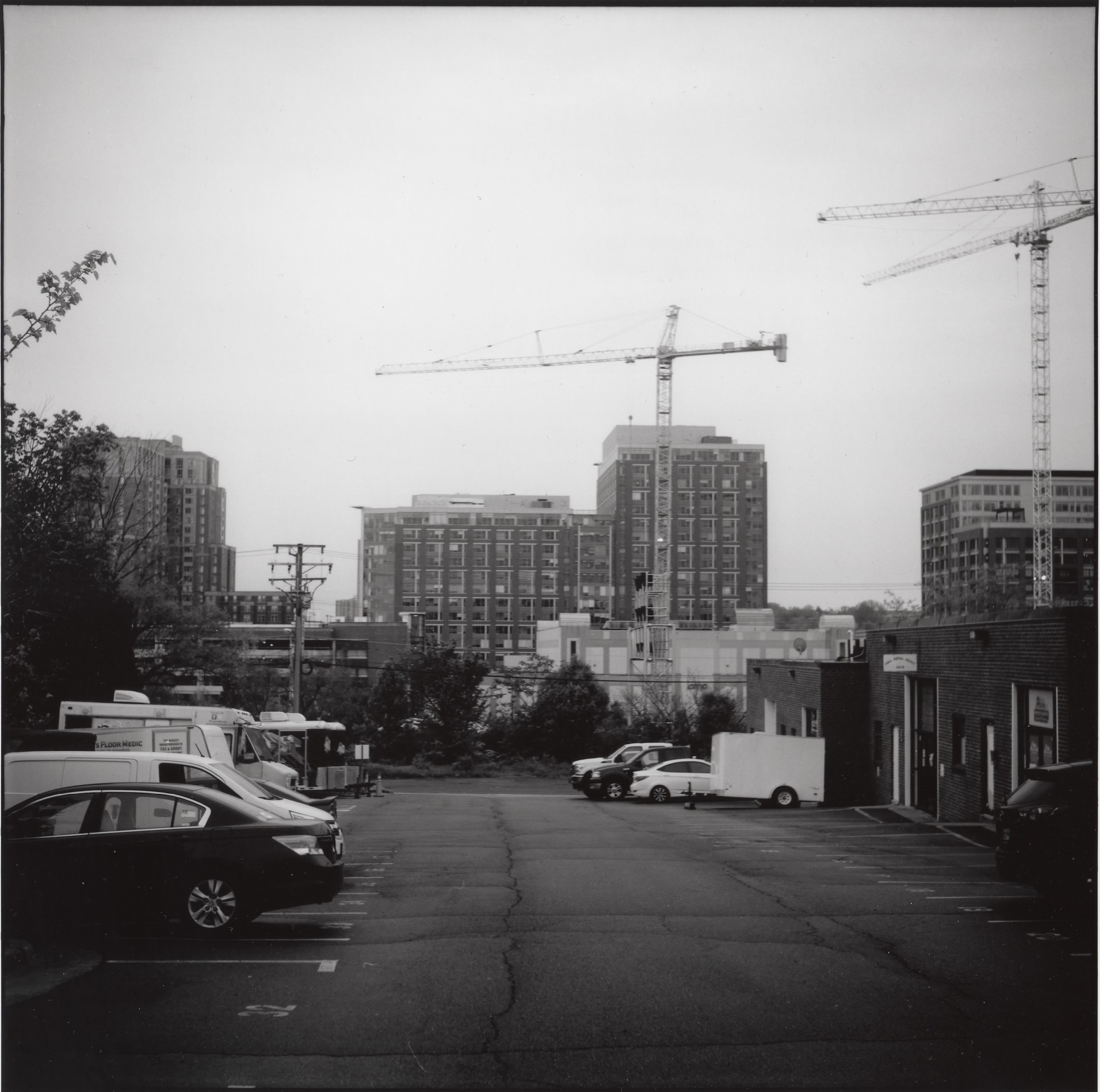
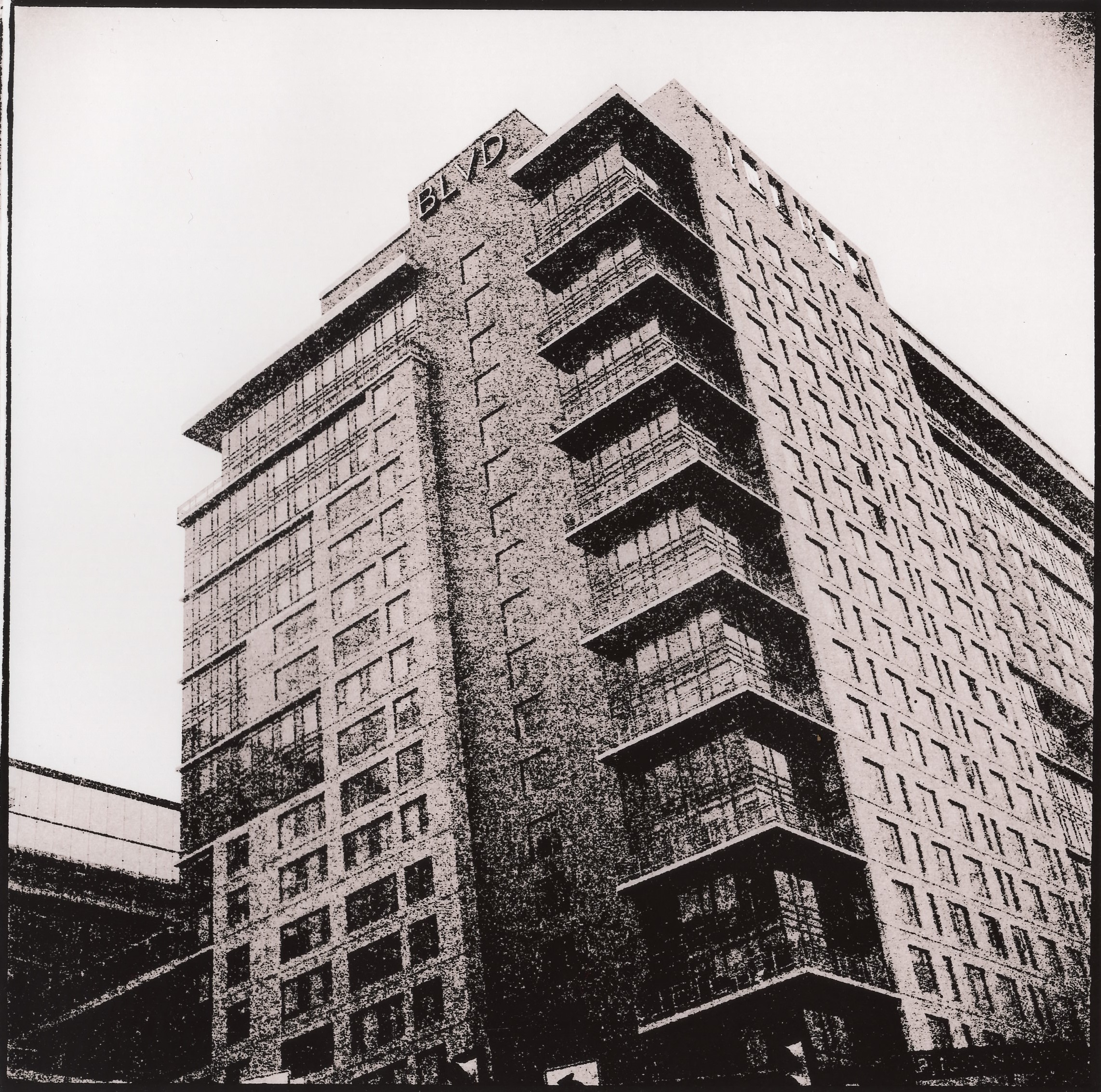
This was the first try. I put the negative in the enlarger and switch on the focus light, and just look at the image on the white easel. I have gotten to the point where I can get pretty close just by looking at how bright the projected image in the dark room is before I put paper in. For a negative of average density, I will start with the light timer at 10 seconds and the enlarger lens aperture stopped to f/11. That looked a bit bright to me, so I closed the aperture down to f/16, stuck paper in, hit the timer, and this print was the result. Not a bad start. But maybe we can darken the sky and those buildings in the background a bit.

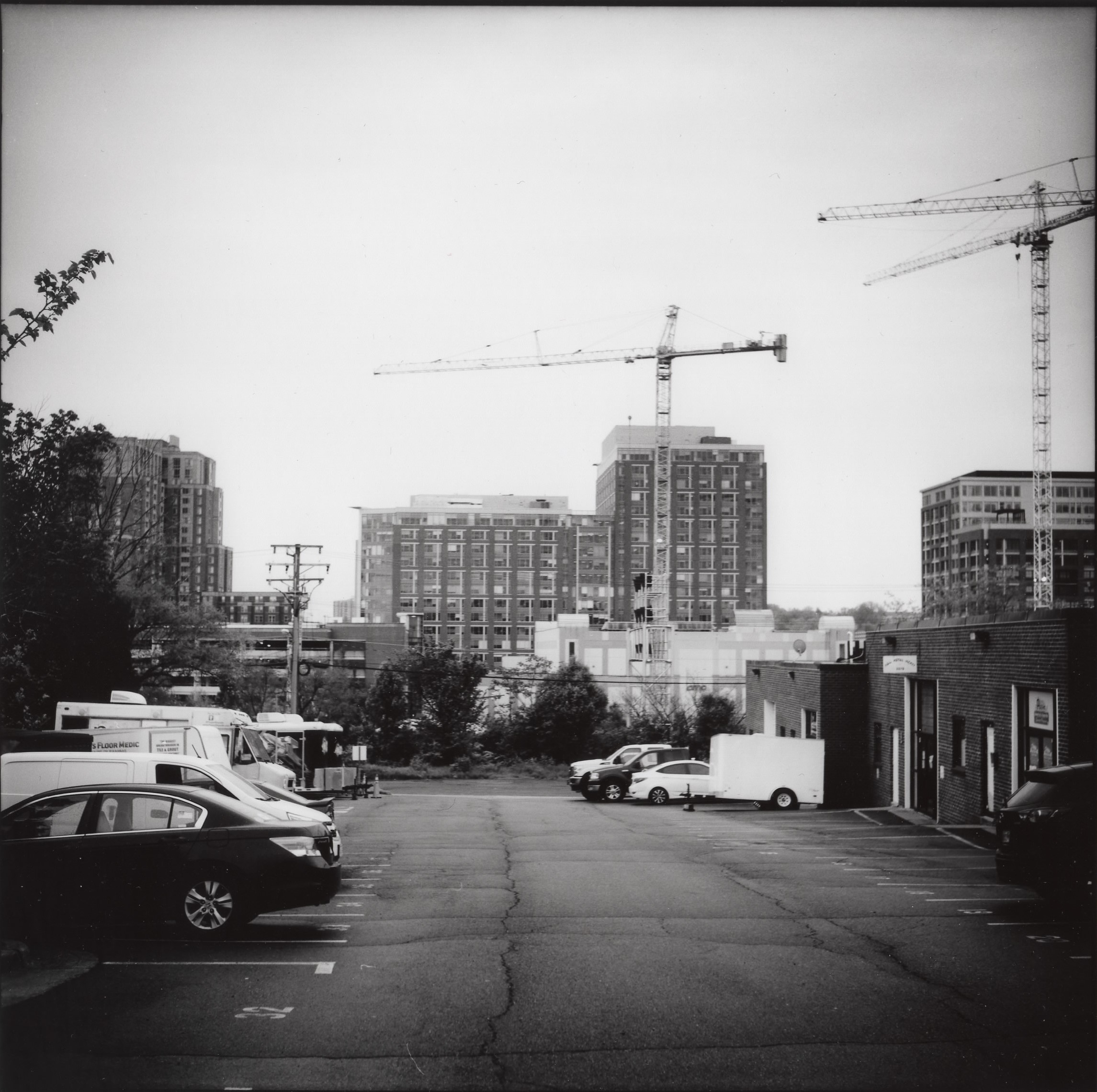
Second try, this time I burned the sky for about one extra stop to darken it, as well as to get those buildings to “pop” (ie. higher contrast) a bit. The cranes are now darker and the overcast cloudy sky has a bit of texture to it. In addition, the vignette effect in the corners of the sky is more pronounced. This is caused by the round filter I used on the camera lens, which protrudes forward a bit from the camera enough to show up in the corners of the square picture. I like the moodiness it adds to these kinds of images. At this point, I have not yet used any contrast filtering while printing.
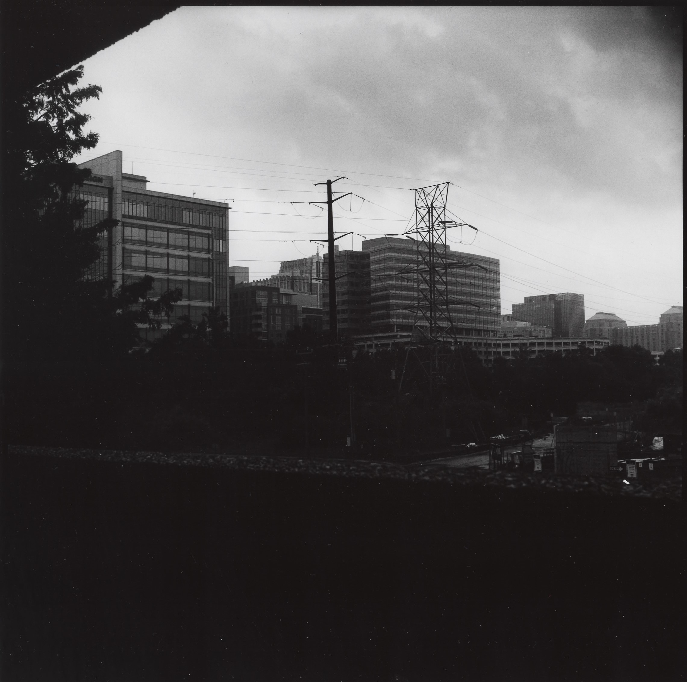
For this attempt, I used a number 4 filter to boost the contrast, and doubled the exposure to compensate for the attenuation of light by the filter. These filters are colored sheets of plastic held by hand over the enlarger lens; a 4 is a darkish red color. Generally speaking with these kind of urban images, more contrast adds to the grit and gloom of the image, and gives it more impact on the viewer’s eye. However, in this case it looks like I didn’t increase the exposure enough, since it came out more washed-out looking than the first image.
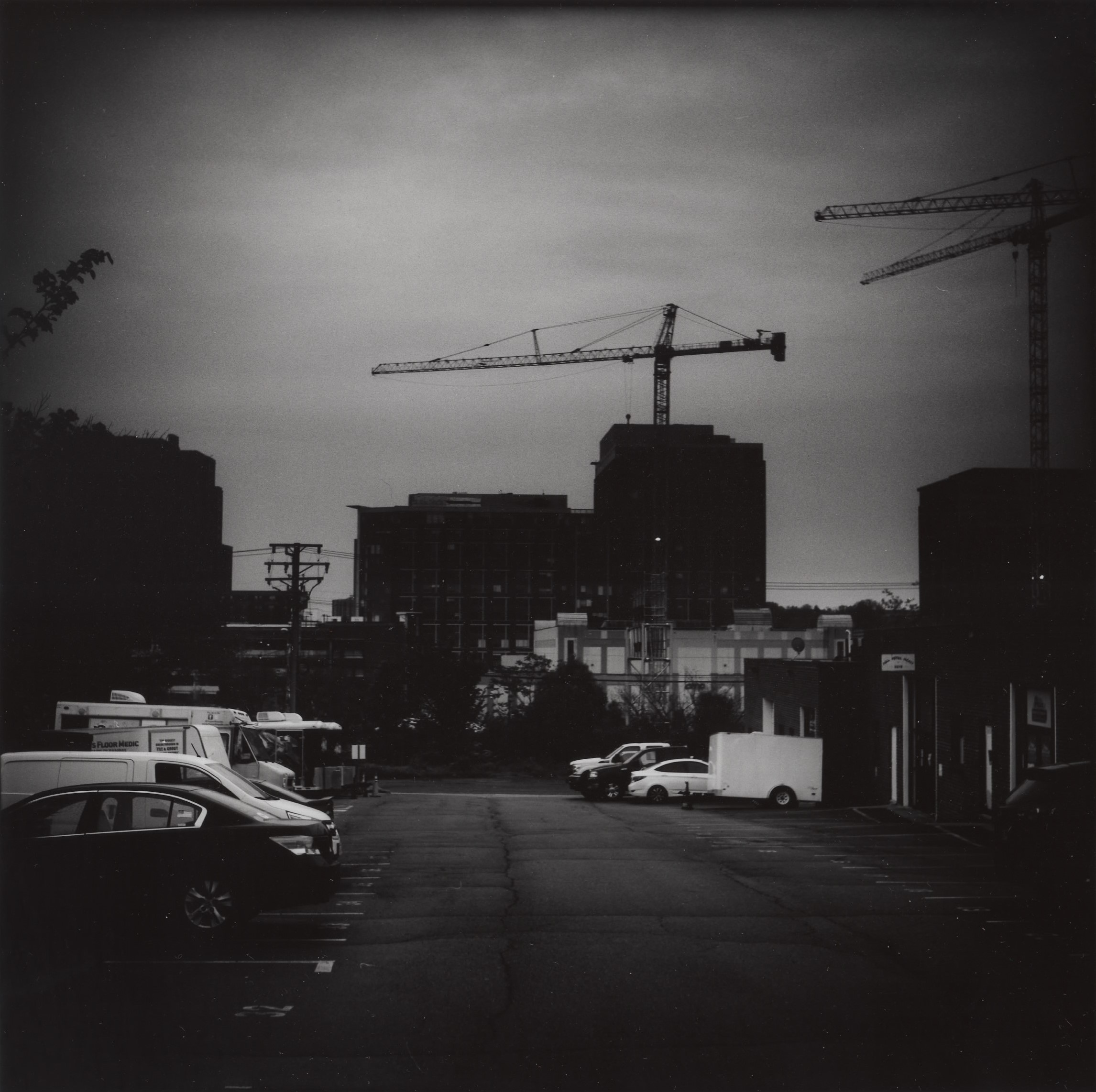
For the next try, I boosted the exposure by a half stop or so, still using a number 4 filter and still burning the sky as before. Well, the sky certainly has the gloom and doom here! Unfortunately, the details of the buildings and other features are now lost in the dark shadow areas. Examining this, I decided that it looks like I need to keep this effect for the sky, but back off on the middle are for the buildings and cars. The crack in the pavement down the center of the image is a key feature that I need to maintain, as well.
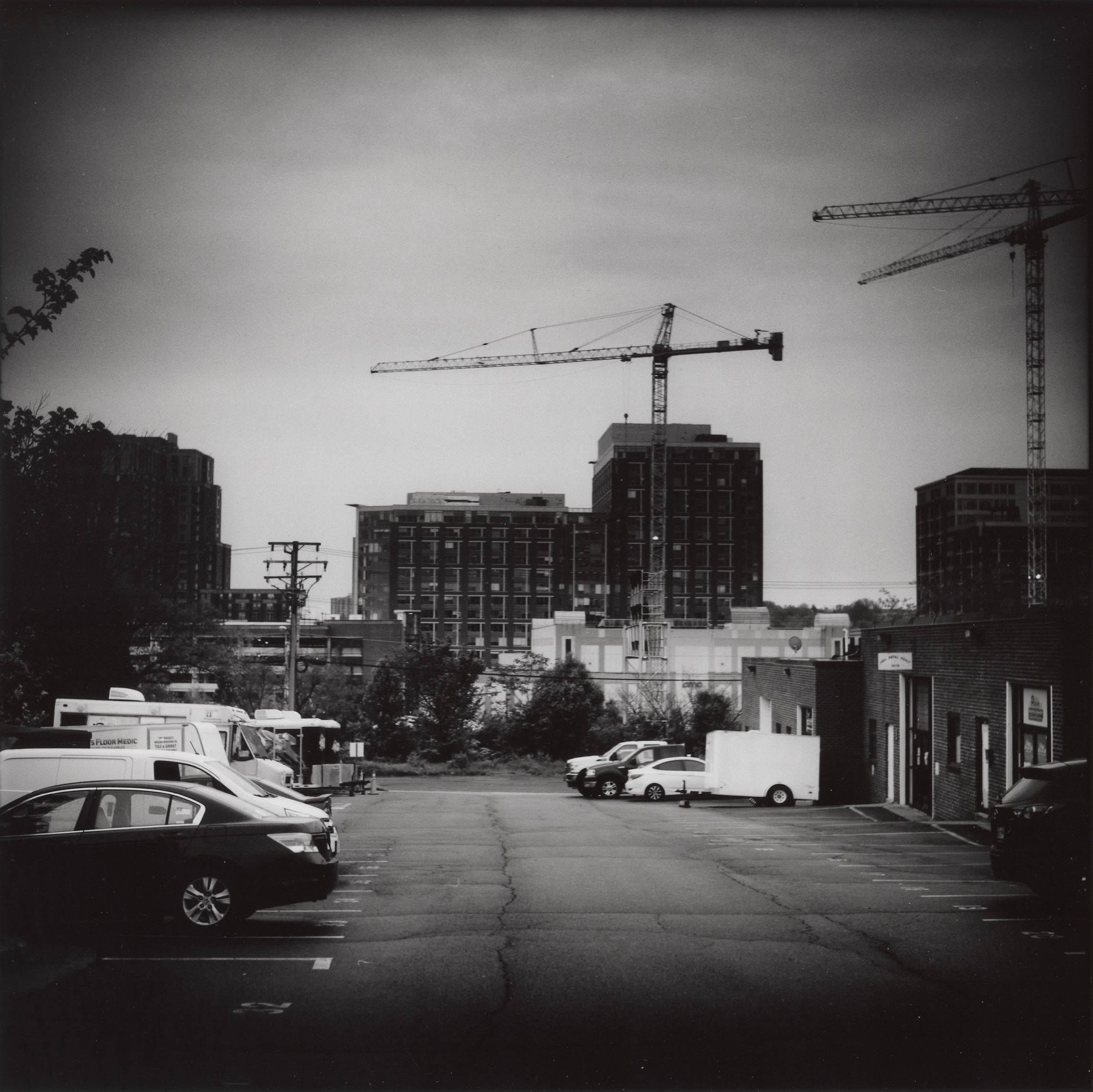
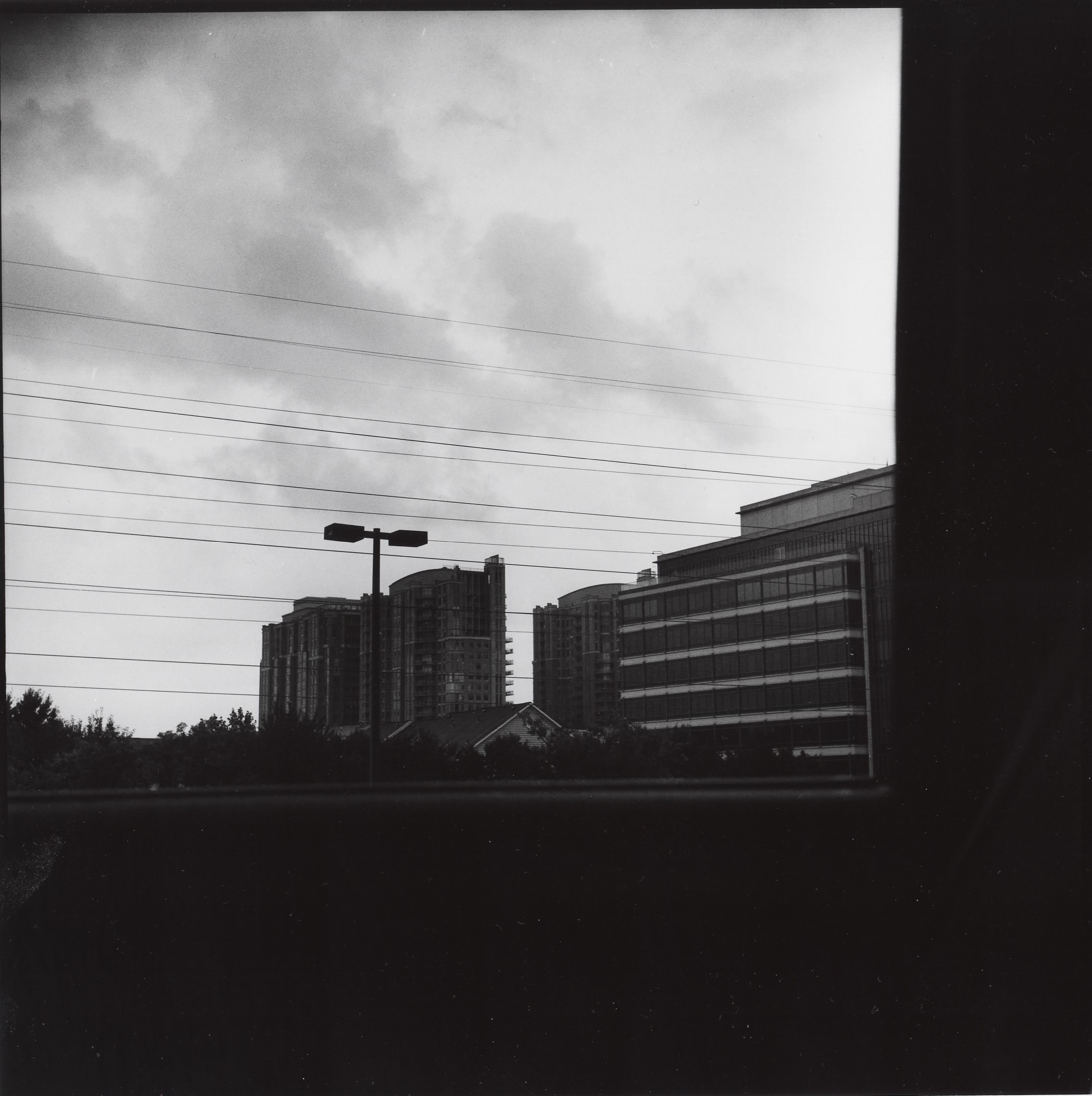
Fifth and final print of the night. This time I once again used a number 4 filter to boost contrast, and burned the sky hard, while holding back the middle area. The parking lot details and bricks are now visible again. I also burned the foreground a bit at the very bottom to draw the eye to the middle and add more mood. Plenty of gloom, sweet and comfy the way I like it for the most part. Is this the final image? Not sure; it depends on how long I stare at it and find things to improve and whether I want to spend more time and paper on it. For example, the trees and buildings on the left and right sides are still pretty dark, but maybe I like them that way, haven’t decided yet.
This can go on for as long as you want it to keep going on, until you run out of paper or chemicals or time. At some point I stop trying to overcook it and move on to another image. I will spend more time on an image I really love or where I am trying to learn something or achieve a particular effect.
These five images represent about two or two and a half hours of work in the dark room, including washing and drying the prints. Paper isn’t particularly cheap, either. These are some of the reasons many people stick to digital, along with the fact that dark room access can be hard to find as well. I get that. But this process is fun and rewarding for me, at least. On a computer you could do what I did above in a few minutes by moving some sliders around, I am guessing. There’s a camera app on my smartphone that can do this while you’re riding the Metro train. But it never looks quite as nice as it does on real silver emulsion to me.
Maybe in the future I’ll do some more “how it’s done” type posts like this.
Zion National Park: View from Angel’s Landing
Image
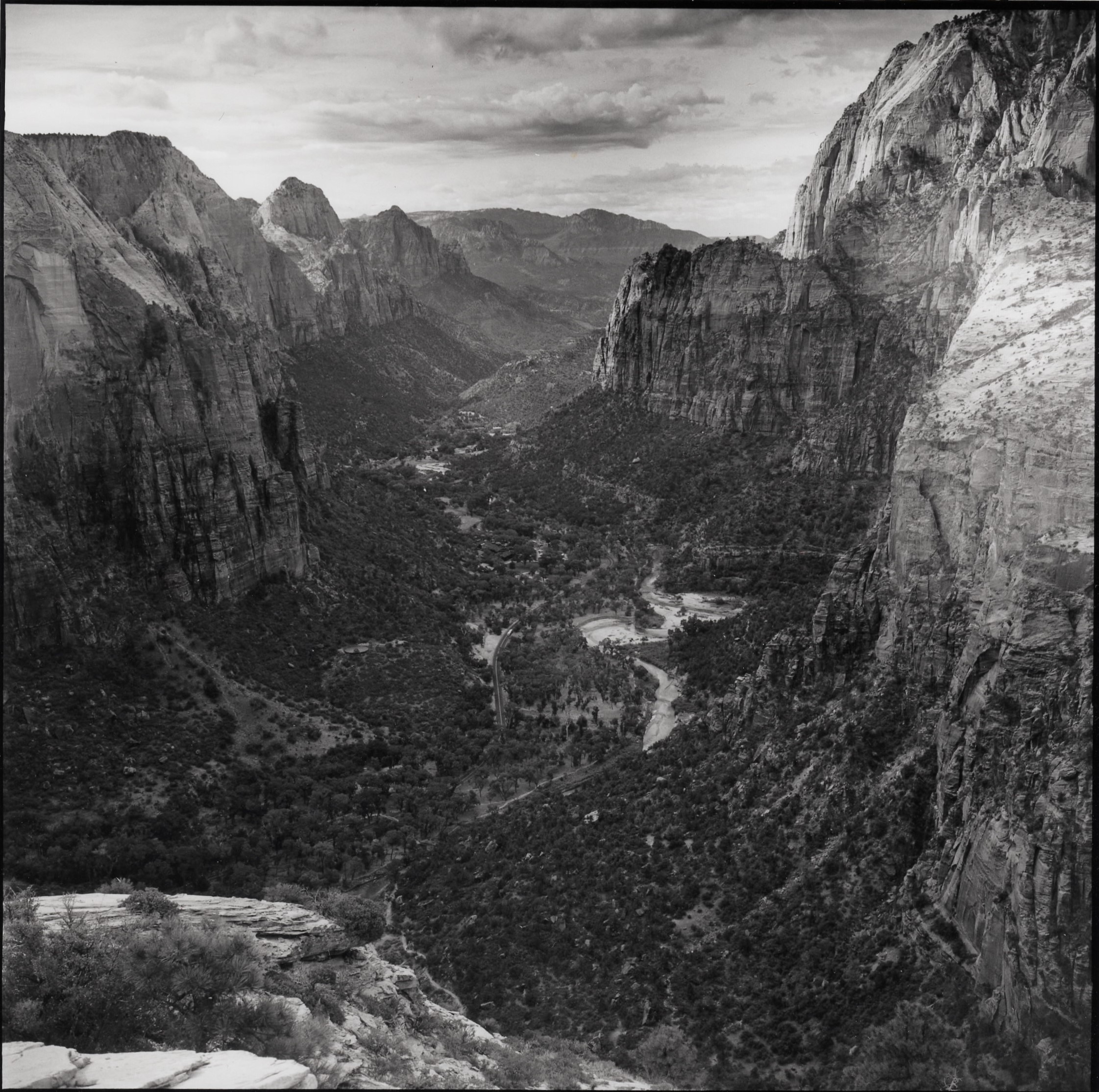
From a few years ago.
Traversing Suburbia
Image